Before HerbTouch became a brand, it was a quiet practice —
a study of herbs, their distinct characteristics, their rhythm, their silent wisdom.
Each plant offers something of itself.
Not just a function, but a way of being.
That understanding became the foundation of everything that followed.
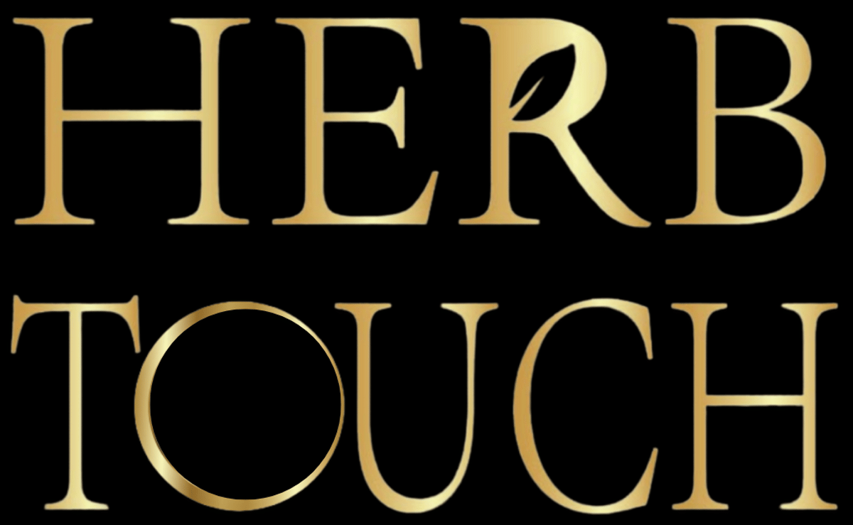
The logo reflects this philosophy.
The circle around the name represents the cycle of life —
how nature moves through patterns of growth, decay, renewal, and return.
It holds a sense of flow: a reminder that everything is connected.
Inside the circle, the letters are gently uneven — each one shaped a little differently.
Like everything in nature — plants, animals, even humans —
there is no uniformity, only diversity quietly coexisting.
The T in “Touch” rises upward like a tree —
rooted, alive, reaching.
And in the center, the U quietly holds a space —
a gentle vessel.
Everything — nature, care, connection — returns and flows toward you.
Beneath the logo, the open hands symbolize more than physical touch.
They represent a bridge —
between plant and person,
between the wisdom of the earth and the human experience.
Through scent, texture, and presence, something living is shared.
This is what the logo carries.
A quiet message, shaped with intention:
That nature doesn’t just grow around us.
It connects to us.
And we are part of its circle.
* If you ever feel like saying something, share your thoughts on
Instagram & Facebook ID: @HerbTouch